Documentation & Consistency
#ProgrammingNote: This is an older post from ghost which I've ported here.
Before we begin, I want to share something. It's a bit of scss I wrote to style snackbars in angular material.
@mixin snackbar-colors($color, $on-color: 'on-' + $color) {
  .#{$color}-snackbar {
    @include mat.snack-bar-overrides((
      container-color: mat.get-theme-color($my-theme, $color),
      supporting-text-color: mat.get-theme-color($my-theme, $on-color),
      button-color: mat.get-theme-color($my-theme, $on-color)
    ))
  }
}
Now that we’ve gotten past that, I want to bring up a topic that can push people away from your system: documentation & consistency.
Motivation and Setup
I am, for the purposes of classification as a programmer, what you would call a back-end programmer. This means that I primarily focus on parts of systems that don’t have visual means of operation. I can do front-end work, but that isn’t my forte. When I do front-end work it’s normally a means to an end. As such I’ve typically taken the path of least resistance and used an admin template for my work.
In the past, that admin template would have been CoreUI. While I wouldn’t ever discourage using CoreUI, I’ve had great difficulties upgrading it once I’ve started using it. Tools like CoreUI (or even raw bootstrap) have a lot of great documentation for how someone might use their tool to make a website. It make take some work getting things set up, but once that’s done it’s fairly easy to use the components.
I’ve tried to use Angular Material three separate times, and only the last have I actually gotten the thing to work. I do appreciate what they are doing, and I’ll start with the good first, but I’m not sure I’d ever want to use it again, I may even rip it out of the project I’m using it in if I find a component library I like more (update: I did rip it out).
The main issues I've had starting it in the past (as apposed to bootstrap) is that: there really isn't a canonical implementation of material, and there are no layout components as part of Angular Material. This means that there isn't a portable way of interacting with material across UI frameworks, and even if there were, you cannot use only material.
As someone not terribly consistent with UI development, those have been hard pills to swallow. Bootstrap handles both of those perfectly, and so I used bootstrap most of the time. The only reason I didn't immediately pick up CoreUI again when I started this project is that I find updating it a pain, and I happened to see the article about the material three schematic.
While the original POC of this site used material, it was actually done in MUI. The reason I was/am switching it to angular is because I needed to do some relatively complex dynamic forms, and doing that in react makes me sweat. Since I was only one page into the POC, and I needed to make significant changes anyway, that was an easy decision.
Something that I always do (or at least nearly always) when I'm making a web-based application is to create the layout. Generally that layout is in the form of a "admin dashboard". As in a tool/menu bar at the top, and navigation on the left-hand side. We're going to get into the colors in a bit, but I was very surprised that I needed zero CSS to create the base layout in that format.
It simply requires two components that come built-in to Angular Material. The toolbar and the sidenav. It takes basically zero effort, and they even have (though I found out after I made mine) a schematic you can use to generate a component that literally makes that layout.
The colors to make it actually look proper however were significantly more effort, and the schematic to add material actually has a pitfall. When you run the schematic it asks you "Hey fam, do you want to start with a pre-built theme or use a custom one?". Any normal person would pick a color pair they thought sounded cool and move on. Under no uncertain terms should you do that. To color anything you need theme object in your scss and you need to make that yourself. So want to make a custom theme, and just update the base colors in the theme object that's created.
Once you have your theme, add mat-app-background to the body class list in your HTML file. I have zero idea why they
don't do it for you, or even need it at all, but it's very annoying. Once you've done all that, you can use colors. My
next problem, is that I didn't know how to actually apply colors for my toolbar or even what colors I should use.
Colors
The specific place in the documentation for how to apply color roles and which ones are available can be found here. It comes down to this, there is a function material provides and this is how you use it.
mat.get-theme-color($theme, $color-role)
As you can see, you obviously need the $theme object in order to use this function. Color role is a little more nuanced. There isn't really a good way to understand what roles should actually be used in what situations, or even what they will look like. Here is the example given at this exact moment.
There is no dark theme version of this document. So I did what I've done in the past, and simply picked primary color
roles basically at random until I found the one I wanted. Specifically I wanted to re-create the toolbar color on
https://material.angular.io when the Magenta & Violet theme were used. The specific color
role I found for the background was on-primary. This was the incorrect color role. The "correct" color role was
primary-container. I say it like that because I actually still don't know. The roles themselves are confusing,
especially with the 'on' roles.
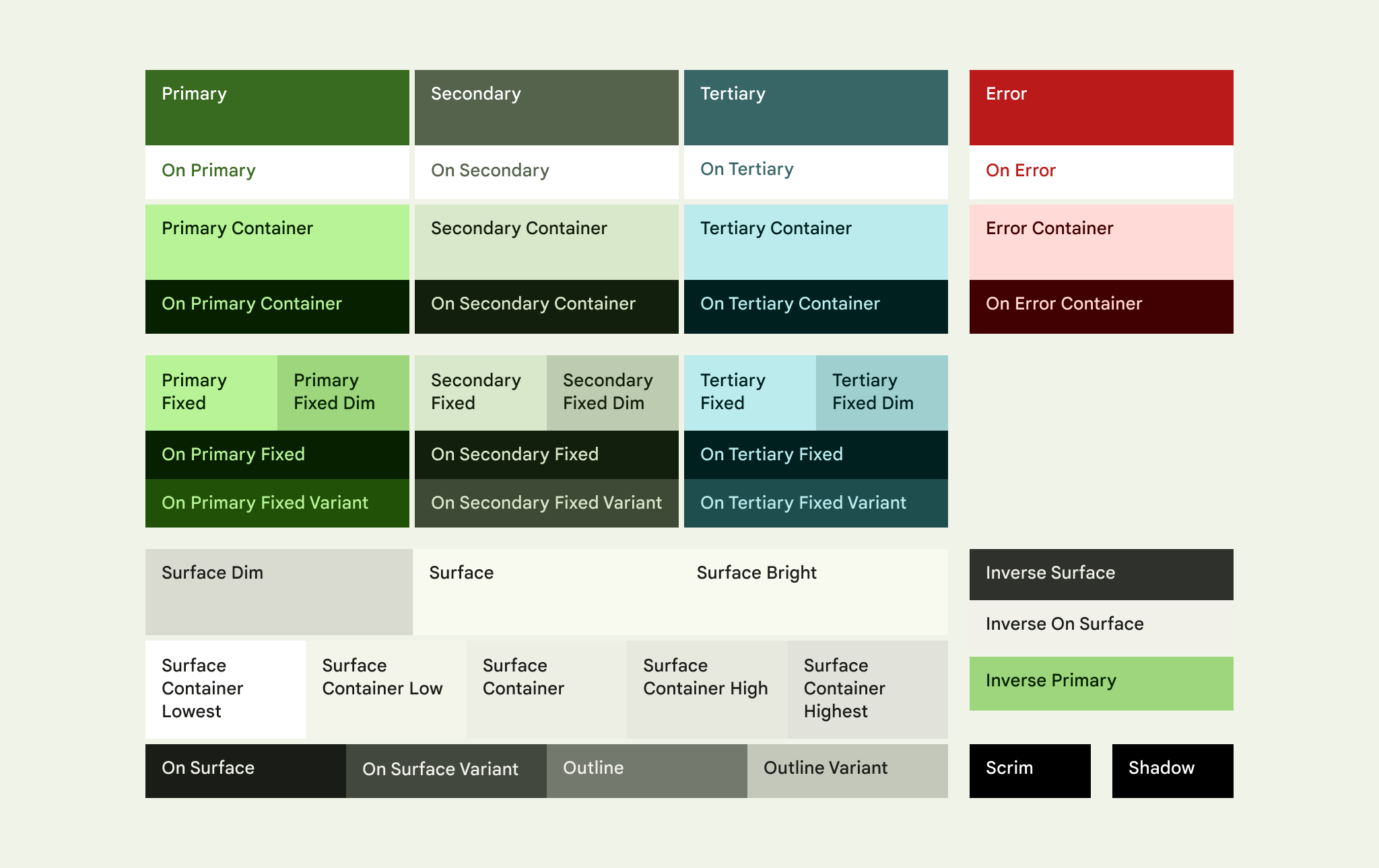
The color chart on the material site is terribly confusing, because they use foreground and background colors as background colors. In the chart, the color in the background is defined by the text. The foreground color is meaningless. Additionally, color role names are reversed in my opinion. The main color is the background and the 'on' color is the foreground. I created my own color chart, to make it easier for me to visualize the parings.
As you can see from the chart, the specific pairing I wanted was primary-container and on-primary-container.
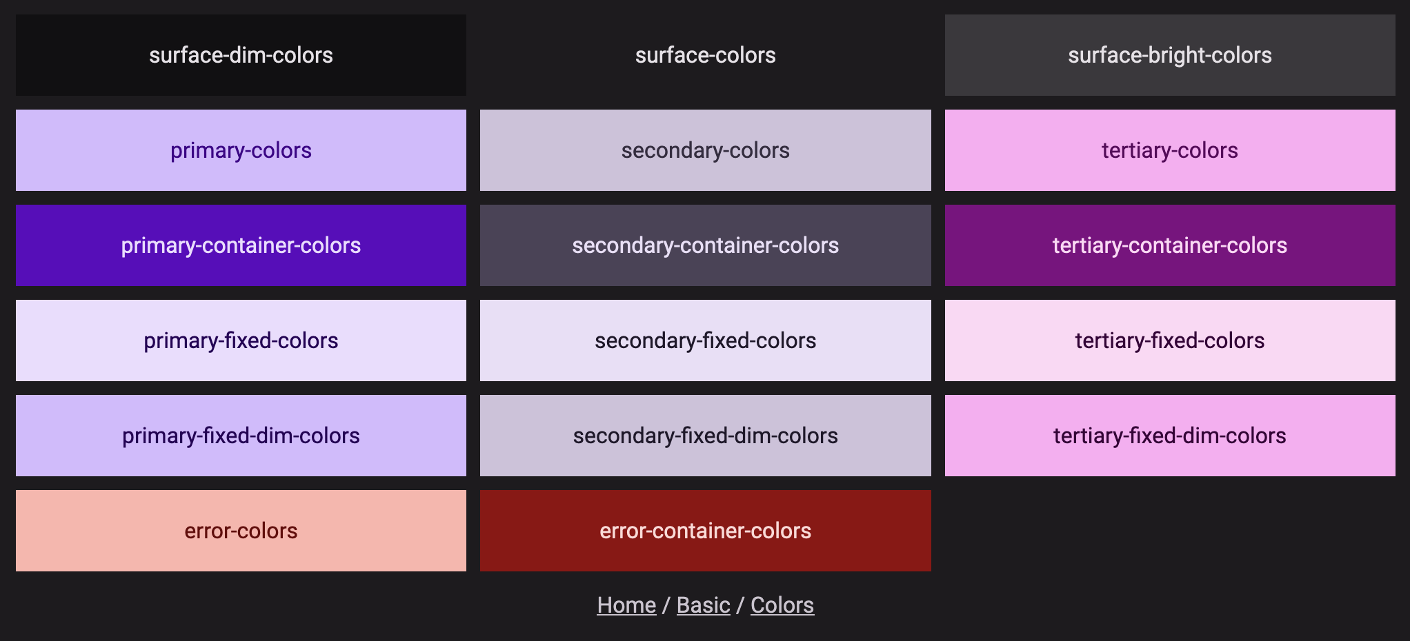
Something the Angular Material team could do is make a similar component as a schematic. I'll probably have the page
remain in my sites as a hidden route to make instant reference easier, as the colors would obviously change if the
pallet changes. The mixin I use can be found here.
@mixin colors($color, $on-color:'on-' + $color) {
  .#{$color}-colors {
    background-color: #{mat.get-theme-color($my-theme, $color)};
    color: #{mat.get-theme-color($my-theme, $on-color)};
  }
}
Applying that with `primary-container`` gave me most of what I needed, but the button colors were off, I updated the color for that as well and went on my way (we'll be coming back to these colors a bit later).
My next task was buttons. I wanted buttons for the primary, secondary, and tertiary colors. Apparently there used to be built-in classes for coloring buttons. These classes have been removed (though there is a fill for them). Instead you are tasked with creating your own classes using variant helpers. The docs can be found here. It's fairly easy, and I made a mixin for these as well. Here is the entirety of the code I used.
@mixin button-colors($variant) {
  .#{$variant}-button {
    @include mat.button-color($my-theme, $color-variant: $variant);
  }
}

@include button-colors(primary);
@include button-colors(secondary);
@include button-colors(tertiary);
@include button-colors(error);
Probably didn't need to be a mixin, but I felt it was cleaner.
Now that I had buttons, I had one last thing I wanted to test: alert popups. In bootstrap these are typically called toasts and in material it's called the snackbar. Generally in my usage I normally have two colors I use for alerts. A primary alert for common feedback, and an error alert for errors.
Before I get into the rabbit hole that was making my error alerts, I want to show my appreciation for the interactive
apis of the material components. MatSnackBar is incredibly usable. The simple fact that I didn't need to build any
state management or containers was fairly nice. All I had to do was inject the class, and call the open method. I did
wrap snackbar usage in a service, but that was only to make calls more consistent with default options.
My goal was to make an error color snackbar. This was much more difficult that I believe it needed to be (and covered a
three day saga). The snackbar config has a property called panelClass. My first instinct was to add a color and
background-color using my colors mixin from earlier. That did nothing. Confused as it worked properly for the navbar I
looked for guidance. Some docs pointed me to using ::ng-deep but also said it was deprecated and shouldn't be used.
Looking at a closed issue, it seems like using css overrides weren't supported, and two links are provided in an earlier post. The first link is to the theming guide, and the second is to a set of mixins related to snackbars. Neither of these links are actually useful, because neither of them can actually help you color a snackbar. There are nineteen mixins documented that support color variants. Their documentation states "Unlisted components do not support any color variants." The snackbar is not listed in the mixins that support color variants.
That continues to be true today, but as of roughly three months ago there is in fact a mixin you can use (though it is virtually useless as we'll get to). One piece of the actual solution is in the issue, it's to use variables representing style tokens. Here's the snippet from the author.
.success-snackbar {
  --mdc-snackbar-container-color: green !important;
  --mdc-snackbar-supporting-text-color: white !important;
  --mat-mdc-snack-bar-button-color: white !important;
  white-space: pre-wrap
}
The idea with the variables is that the DOM will carry them down to the appropriate locations within the tree. 100% I'm onboard with this method. If folks rely on specific DOM implementations for components it makes it super hard on the team maintaining the components.
The problem is that these variables are not actually documented anywhere. I found the correct ones I needed for the few places I was using them based on a tip discovered in a forum to view the colors in the inspector. Finding them out without that method I'm pretty sure is basically impossible. The documentation specifically says this "The CSS custom properties emitted by the theme mixins are derived from M3's design tokens." If you look at that site, nowhere does it actually tell you what the tokens are.
If you'll notice from the example below, you'll notice that there are two prefixes: mdc, and mat. Between the two the component name isn't consistent. While you can technically guess what the MDC tokens are based on the documentation (sometimes), there is zero way to find the variable that way for the button color. This is because the button in the snackbar isn't actually a part of the spec.
Using the inspector method I was actually able to correct the styles for my toolbar, it meant that I could save a selector because the color for the toolbar propagated to the buttons (which is why the method of using variables is so helpful). My first version of the snackbar mixin looked like this.
@mixin snackbar-colors($color, $on-color: 'on-' + $color) {
  .#{$color}-snackbar {
    --mdc-snackbar-container-color: #{mat.get-theme-color($my-theme, $color)};
    --mdc-snackbar-supporting-text-color: #{mat.get-theme-color($my-theme, $on-color)};
    --mat-snack-bar-button-color: #{mat.get-theme-color($my-theme, $on-color)};
  }
}
It worked, and it worked well. But I couldn't shake how confident that issue was that we should be using those mixins. I felt something was wrong, and I couldn't put my finger on it. Looking at the scss file there was only a single public function that didn't just take in a theme as the only parameter. The function seemed like it would do what I wanted, as in emit the variables I needed, but there wasn't any documentation on how to actually use it.
Looking through the function I made a guess that I could send in a map without the prefix or component name as part of the keys. I was in fact correct. That was a fairly wild guess, and it worked and got me what I needed. I updated my toolbar to use the same method (though obviously the toolbar theme version).
Why It Matters
I like Angular Material. I like it a lot. I think the typescript facing APIs are some of the best I've used, and they have great documentation. Styling it has likely been the second worst experience I've had with a styling framework. It's not like it's even that bad to use the tools, it's that finding out how to use them is very difficult when there is effectively zero documentation or examples.
I don't even know if the overrides function is even meant to be a public API that people use. I submitted an issue to
their repository to find out here (follow up note: one month later
and nobody from the team as said a single word on the issue).
What I see will be the reaction to this situation is folks doing incredibly wild nonsense to get their work done. The intentions behind the MDC changes is meaningless if the documentation makes it a brick wall to actually use effectively.